
Generalised additive models
Presenter(s): Sophie Lee
Generalised additive models (GAMs) are a flexible class of statistical models that aim to explain the relationship between an outcome of interest and one or more covariates. GAMs differ from traditional regression models (also known as generalised linear models, or GLMs) as they allow users to include nonlinear relationships between the outcome and covariate(s). GAMs are sometimes seen as a middle ground between linear models and machine learning: they can cope with complex relationships that are beyond simpler linear models, but uphold the interpretability that is often lost when using machine learning approaches.
The Image below was redrawn from ‘Introduction to Generalized Additive Models’ by Dr. Noam Ross.

How do GAMs work?
Generalised additive models (GAMs) are statistical models that include smooth functions of covariates to allow flexibility in the nature of the relationships between an outcome and explanatory variables. The original GAM was defined as:
 = \alpha_0 + \sum \alpha_j x_j + \sum s_k(z) ).")
where g is some link function determined by model choice, μ is the expected outcome variable, x and z are observed covariates, β are unknown regression coefficients, and sκ are smooth functions, both to be estimated during the model fitting procedure.
The first part of this equation, up to the smooth function(s), works the same as any standard GLM, and includes linear relationships between the outcome and covariates x . The inclusion of smooth function(s) allows for more flexible model specifications and the inclusion of nonlinear relationships between the outcome and explanatory variables. However, this additional flexibility comes at a cost: the structure of sκ must be determined and the degree of ‘smoothness’ must be defined.
Smoothing splines
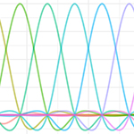
Another name for the smooth functions s in a GAM equation are smoothing splines. There are many different types of smoothing splines available, from more simplistic approaches the apply polynomials to covariates, to very complex multi-dimensional functions capable of capturing space-time relationships.
Smoothing splines can be broken down into a linear combination of known basis functions b and unknown coefficients β that are estimated from the data:
 = \sum_{i=1}^{k} b_i(z)\beta_i )")
The larger the number of basis functions, or k , the more wiggly the smoothing spline becomes. The number k is also referred to as the number of knots or turning points in the smooth function: k = 0 would produce a straight line, whereas k → ∞ would produce a very wiggly line that passes through every observation. The objective is to find some middle ground that is wiggly enough.
> Download the example code (used in videos 2 and 3): script.R
Model diagnostics
As with any statistical model, we must check our GAM to ensure the method is appropriate, and that our results are valid and robust. Many model checks are similar to those of the models’ linear equivalent: assumptions of residual distribution and variance, independence of predictor variables. Some assumptions are specific to GAMs, such as the degree of ‘wiggliness’ allowed by a smoothing spline. The R function gam.check (from the mgcv package) returns useful diagnostic statistics and plots that can aid the diagnostic process:
 scroll down.")
The first plot produced is a qq-plot, comparing the theoretical quantiles of the assumed model distribution against observed residuals. Ideally, residuals should be lying along or as close as possible to the line of equivalence. If this is not the case, we may wish to consider using an alternative model distribution. The histogram of residuals can also be used to check underlying model distributional assumptions. For example, if we assume an underlying normal distribution, these residuals should follow a normal distribution, centred around 0. Where this is not the case, other distributional assumptions may be considered. A scatterplot with model residuals against the observed linear predictor in the model can be used to examine residual distribution: do they follow a constant variance, or are there signs of heteroskedasticity (unequal variance)? Finally, a scatterplot showing the observed outcome variable against the predicted outcome from the model, can be used to check the predictive performance of the model.
Another output of the gam.check function allows us to check the estimated ‘wiggliness’ of smooth functions. Although the number of knots (or k) is estimated as part of the model fitting procedure, users are required to set a maximum number. This maximum should be large enough to ensure the smooth function can capture the nature of the relationship, but not so large that the model fitting becomes too computationally costly (too high values of k does not improve the model fit but will slow the model fitting down).
Basis dimension (k) checking results. Low p-value (k-index<1) may indicate that k is too low, especially if edf is close to k':
| k' | edf | k-index | p-value | |
| s(temperature_c):rainYes | 19.00 | 5.22 | 1.05 | 0.92 |
| s(temperature_c):rainNo | 19.00 | 6.95 | 1.05 | 0.92 |
| s(humidity_percent) | 9.00 | 6.88 | 0.99 | 0.47 |
Output contains the maximum number of k, based on the model formula (R sets the default to 10), the estimated value of k (given as edf) and a p-value testing whether the maximum k was sufficient. Small p-values indicate that k was set too low and the maximum level of wiggliness should be increased.
> Download the example code (used in videos 2 and 3): script.R
> Download Worksheet with answers.
- Alternative text (for accessibility) for the image showing diagnostic statistics and plots that can aid the diagnostic process:
The image is a composite of four different plots related to statistical analysis. The top left plot is a Q-Q plot titled "deviance residuals" that compares theoretical quantiles against deviance residuals, showing points mostly following the diagonal line. The top right scatter plot labelled "Resids vs. linear pred." displays residuals against the linear predictor, with a horizontal distribution of points. The bottom left plot is a "Histogram of residuals," illustrating a bar chart that shows a mostly normal distribution centred around zero. The bottom right scatter plot, titled "Response vs. Fitted Values," shows a positive linear relationship between response values and fitted values through scattered data points.
Alt-text:
Four plots showing Q-Q plot, residuals vs. linear predictor, histogram of residuals, and response vs. fitted values.

About the author
Dr. Sophie Lee is a statistician and educator who teaches statistics and R coding courses to non-statisticians. Her goal is to provide accessible, engaging training that proves that statistics does not need to be scary. She has a PhD in Spatio-temporal Epidemiology from London School of Hygiene & Tropical Medicine (LSHTM) and is a Fellow of the Higher Education Academy. Her research interests lie in spatial data analysis, planetary health, and Bayesian modelling.
- Published on: 25 February 2025
- Event hosted by: University of Southampton
- Keywords: Statistical Theory and Methods of Inference | Regression Methods | Measurement Error | Model Diagnostics | Data Quality and Data Management | Computational Tools |
- To cite this resource:
Sophie Lee. (2025). Generalised additive models. National Centre for Research Methods online learning resource. Available at https://www.ncrm.ac.uk/resources/online/all/?id=20851 [accessed: 14 December 2025]
⌃BACK TO TOP